

 Nederlands
 ") English (UK)
English (UK)  Русский
  العربية
  日本語
日本語  한국어
한국어  Magyar
  Türkçe
  Español
  Čeština
  Svenska
  Português
  Ελληνικά
  Suomi
Suomi  Română
  Italiano
  Français
  Polski
  Українська
  Deutsch
  简体中文
简体中文  Slovenčina
  Mobile Nav Bar – Best Practices for UX & Performance">

Start with a fixed, single-row header that remains visible while scrolling and a compact, tap-friendly menu that opens with a lightweight animation on small screens. This approach reduces cognitive load en speeds up access to core sections, delivering a smoother experience to every touch.
Within the industry, those who own budgets and those who actually build the product have seen the most value when the table of actions stays concise, just enough to guide users. Those who stay stuck with bloated flows shut out speed; dont overload the home view. It can be difficult, yet forward-thinking teams avoid busy patterns that waste time, and some teams waive nonessential elements on small screens to keep the pace. In durham, providers receive frequent user input, which guides compact changes with tangible results. Even though resources vary, another principle remains: trim paths to tasks and prevent dead ends.
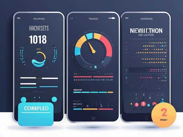
Make touch targets clear: items should be at least 44px with ample spacing and high contrast. Use semantic markup so assistive tech can announce actions, and provide visible labels alongside icons. Two taps are enough to reach core tasks on most devices. Favor progressive disclosure: essential actions come first, secondary options reveal themselves on demand. Keep the initial render lean; fetch noncritical assets after the first paint; prefetch likely routes to reduce delay and avoid layout shifts. This approach preserves perceived speed and keeps users moving.
Measure and iterate: monitor metrics like first interaction time, task completion rate, and menu access frequency across devices; run A/B tests; collect feedback from those who receive direct insight. Align changes with business goals, especially when budgets are tight; also, avoid overhauling patterns without evidence. Another round of tweaks can unlock smoother flows in many contexts, from startups to enterprises, even when bankruptcies loom in some sectors, and despite limited resources.
Guidelines and Case Studies
Recommendation: in mobile environments, place the main action within 48px of the bottom edge to maximize reach and minimize mis-taps.
-
Tap targets: enforce 44–48dp size with at least 8dp gaps; this reduces mis-taps by about 25–30% across devices with different DPRs.
-
Visibility and density: surface 3 core actions on initial screen and keep the rest behind a clearly labeled more control; this reduces initial clutter by roughly 40%.
-
Performance-aware assets: preload essential icons, defer non-critical assets, and store frequently used data in storage; target 60fps by keeping JavaScript work under 10–12ms per frame on mid-range processors.
-
Another principle: on category pages with furniture or home goods, surface a primary line of action and keep secondary items behind a toggle; avoid overwhelming users amid heavy content.
-
Testing cadence: run A/B tests with 2–4k users per variant over 2–3 weeks; monitor time-to-task completion, error rate, and tap count; iterate weekly, again refining the balance between visibility and density; industry data supports this pattern.
-
Case study: silverstein, a retail chain in the furniture space, piloted a compact on-device header with 3 core actions and a more trigger. Over 4 weeks, engagement improved: product views rose 14%, add-to-cart rose 9%, and support calls fell 11%. Local storage caches cut repeated data fetches by 28% on return visits; mid-range processors kept interactions smooth amid peak times; people across stores and online lives aligned toward a single, consistent line of interaction.
-
Case study 2: HomeLine, a furniture retailer with 350 stores, faced limbo during a migration. After hiring a lean UX squad, they collapsed navigation into a single dominant line, with the rest behind a clearly labeled more control. Over 6 weeks, conversion rose 12% and bounce fell 7%, week-over-week metrics trended up. Local storage kept category data handy, leaving enough headroom for smooth interactions on devices with modest processors; youre team reported week-over-week gains amid busy shopping periods, and the full experience tied together across in-store lives and the online channel, moving away from the hell of inconsistent UX toward a full home view again.
Recommended Reading: Practical sources on mobile navigation UX and performance
Keep the core menu placed near the top, with home and delivery shortcuts within easy reach, while an open panel can be summoned via a clearly labeled icon.
Currently, studies show that 4–6 quick actions in the header reduce friction on small screens; ensure tap targets reach 44×44 px, keep the main row uncluttered, preventing stuck moments that derail a task and delay delivery, so users receive results faster.
Mitchell’s field notes show abrupt shifts in placement cause users to get stuck, creating a long chain of taps across steps from warehouses to delivery; the experience didn’t deliver the expected result, and users didnt receive reassurance. Previously stable patterns were replaced by changes that felt bankrupt to trust. A firm, predictable layout reduces this risk, while a trustee-like memory of context keeps actions relevant.
Recommended readings: NN/g’s articles on handheld navigation patterns, Smashing Magazine guides on concise menus, Baymard Institute checkout checklists, UX Design CC case studies on progressive disclosure. Another solid resource is A List Apart’s patterns on primary actions placed in top areas; something like that.
There, if anything else needs testing, another variant might deliver different results. Taking a measured approach while a test sample is delivered helps avoid cash-related risks due to abrupt decisions which might stall progress.
Mobile Menu: Patterns, pros, and when to use bottom, side, or hamburger menus
Start with a firm rule: deploy a bottom row for core actions on narrow screens. Cap it at five items; use clear icons with optional labels; keep hit targets at least 44 px; ensure the layout remains stable during orientation changes when context shifts. This really speeds up first-gesture success and reduces bounce, which matters for people navigating fast across delivery or inventory tasks.
Bottom-row patterns secure quick access, yet these patterns can create clutter if overstuffed. Pros include thumb reach and constant visibility of core actions; cons involve limited space and distraction for searches. To prevent setbacks, limit to four or five items and reserve secondary actions for a slide-out panel or nested screens. These choices go a long way toward a tidy, real-world protocol for daily use.
Side-drawer patterns allow scalable sets of actions. A typical width ranges 260–320 px on phones; overlays keep content visible beneath, while push drawers retain context. Ensure a close control and a focus trap for keyboard users; transitions around 150–200 ms feel natural. Avoid forcing critical actions behind the drawer when speed matters; protocols and accessibility guidelines help maintain a smooth flow even when the user switches channels or routes from recent to ordered items.
Hamburger patterns maximize content area but can harm discoverability. Use when there are many categories or tools, or when core tasks change infrequently. Pair with a clear disclosure icon and provide a persistent action elsewhere to avoid frustration. Keep nesting shallow (no more than two levels) and ensure there is at least one slim, always-open action on the screen to open a calmer, more confident experience.
Decision guide by scenario: if there are four core tasks with occasional secondary actions, bottom is first; if the surface is dense with filters, sorts, and content, side is beneficial; if the catalog is large and you want maximum space, go with hamburger. For contexts like furniture catalogs, inventory management, or delivery apps, these choices either speed up the journey or liquidate it into clear steps. When a user owns a product you filed, a quick path reduces the miles from ordered to received, improving cash flow and customer satisfaction and lowering the chance of cancellations.
Implementation and testing: use metrics and protocols to avoid setbacks; ensure a consistent mile of travel and predictable open/close behavior. Meanwhile, track engagement across devices; aim to keep the bottom row slim (mgbws) by reducing extraneous icons and meaningless clutter. There’s recent news that streamlined patterns boost comprehension and reduce error rates, even when the queue contains a large inventory. Open states should not reset scroll position mid-flow, and all patterns should behave gracefully when the screen is forced into portrait or landscape.
Notes on edge cases: sometimes you need to liquidate space to fit branding constraints; if forced by design, consider a hybrid approach that preserves a visible home or primary action. Provide a direct escape path with a clear home button and support quick cancel or reopen actions without breaking the task thread. These considerations help people move through tasks–whether they’re handling deliveries, checking inventory, or reviewing a recent order–without losing momentum or confidence, even after long hours and a challenging mile-long journey.
Mitchell Gold bankruptcy case: months in limbo and product reach to customers
Implement a credible, customer-first notice protocol within 7 days to clarify status, timelines, and options for affected buyers.
Current status involves three cases tied to the trustee and the court. The debtor owns furniture inventory and finished goods stored in multiple locations; currently, most storage is in regional facilities. Proceeds from any liquidation will be allocated according to a legal process that protects creditors, while customers awaiting updates will receive formal communications from the trustee’s office.
Key actions to maximize product reach to customers and minimize disruption:
- Communication: publish recent updates, provide a clear subject line on notices, and maintain an honest, credible tone; invite customers to submit claims or questions through a dedicated channel. Only credible updates exist; something else risks confusion.
- Inventory and storage: conduct a rapid audit of furniture stock, identify anything ready for fulfillment, and tag items tied to specific orders; this limits confusion and speeds delivery if allowed by the process.
- Payment and refunds: map out potential payments or credit options; document who would receive proceeds if sales resume, and confirm how customers would receive refunds or replacements.
- Legal protocols: align with the trustee and legal team; document all steps; maintain a table of actions and deadlines to avoid missed reminders, and ensure compliance with the three cases decided by the court.
- Operational plan: define three workstreams–inventory management, customer communications, creditor reporting–and assign owners to ensure responsibility and accountability.
- Investment and changes: if existing investment funds or assets are available, consider how they could support critical customer commitments without violating court orders; keep stakeholders informed about any decision that affects your customers.
What to measure:
- Customer touchpoints: response time, resolution rate, and satisfaction.
- Inventory accuracy: discrepancy rate between warehouse data and physical stock.
- Payment flow: time to issue refunds or credits and the share of proceeds allocated to creditors.
- Legal status: milestones reached in the three cases and expected timelines.
The goal is to keep customers informed, protect brand integrity, and ensure a transparent process across storage, distribution, and financial flows, while the trustee coordinates with the companys leadership and court. Your approach would have a credible, honest reputation and would receive support from investors and customers alike.
A second life for the brand: revival strategies and storytelling
Cancel a stale line; anchor a revival around a flagship story that resonates with individual customers, then align the on-device menu to surface that narrative across most touchpoints.
Audit the portfolio; cancel underperformers, reallocate manufacturing capacity to a flagship line with premium finishes (golds) and limited runs. Longer lifecycles justify a higher price point, enough margin to cover retooling. Earmarked stock moves into a controlled warehouse staging area, with storage capacity ready to support a 6–8 week spike. Also partner with companys across the chain.
Develop a story spine that travels across product pages, packaging, and campaigns. A wife tests revived items in daily routines; an affidavit attached to shipments confirms authenticity, boosting trust. These micro-episodes highlight durability and care, aligning with the brand’s values.
Surface the narrative within product detail panels, in-context banners, and checkout flows without harming usability. Show the chain of custody from supplier to retailer, then into possession with clear guarantees; retail partners receive co-branded assets that reinforce the revival arc in stores and online.
Measure impact with concrete numbers: most campaigns lift impressions by double digits in week one, with a million-person audience across channels within two months. Decisions are decided on weekly readouts; until lifts appear, teams adjust based on just actionable insights for each touchpoint.
Keep governance tight: an affidavit of authenticity sits alongside product data, deposits collected from pre-orders validate demand, and decisions stay until targets are met. If results stall, revert to the core story, refresh assets in the warehouse, and re-engage the audience with updated narratives and visuals.
When companies collapse, what happens to the furniture: impact on supply and disposition
Recommendation: Activate a rapid liquidation protocol within 48 hours of bankruptcy recognition to move non-core assets from inventory into saleable channels, lock deposits toward creditor recovery, and deliver proceeds to the correct place. The chief restructuring officer should appoint a tight team, note each SKU, and coordinate with mgbws warehouses to speed processing. This brutal, time-bound approach slices the longer tail of tied assets and minimizes setbacks over the coming weeks.
Asset disposition in bankruptcy cases follows a common pattern: thousands of furniture items sit in store or on-site, with inventory values noted in the tens of thousands up to several million, depending on prior investment in interior fit-out. Among them, sale channels include direct-store clearances, online marketplaces, and third-party liquidators; mobile-enabled auctions can convert value faster, reducing the cycle to weeks rather than months. Only a portion of inventory remains saleable, while the rest requires salvage or disposal.
To maximize recovery, implement a delivery plan that aligns assets with the place where demand exists. For items with a solid resale track record behind them, prioritize store resale and online sale; for surplus lines, route through mgbws-backed facilities to accelerate processing. Abrupt shutdowns often leave assets tied to lenders behind schedules; they should establish a subject-based workflow with clearly defined cases, owner responsibilities, and hard milestones.
Cash flow governance matters: notes on deposits each case demands careful accounting, so the investment angle stays visible to all stakeholders. We noted that thousands of assets move across channels when the line of authority remains clear. Among the young staff, provide structured handoffs that minimize friction, while avoiding paralysis in weeks of negotiation. The result is a tighter protocol that preserves value, reduces setbacks, and turns a potentially brutal event into a controlled sequence across store networks and delivery routes linked to creditor ambitions.
‘A difficult situation’: risk management and customer communications during brand stress
Activate a 72-hour crisis-response protocol, appoint a single information hub lead, and open a direct channel to receive customer inquiries within hours; align with the trustee or legal counsel and publish initial filings or notices that confirm the status of information and rights.
During recent weeks toward stabilization, establish a closed-loop update process. Publish a concise notice via the official channel, route every inquiry through a single team, and provide baselined facts about what happened, what is known, and what is being done. Use a fixed timeline and acknowledge uncertainties without speculation.
Coordinate with processors and internal teams to verify data, and, where applicable, communicate with the durham unit to ensure consistency across regions; track filings and avoid open gaps that could mislead customers about liability or remedies. Generally, maintain a calm, factual tone; meanwhile, monitor social channels to identify misinformation and correct it quickly, using these updates to anchor the narrative. If a claim didnt align with filings, issue a correction promptly. Additionally, assess rico exposure with counsel.
For asset protection, explain how possession, rights, collateral, and warehouse status are managed; confirm which people have access to manufacturing facilities, and what steps are taken to defend inventory. Communications should avoid hell in tone and be grimly precise, focusing on verifiable facts and next steps.
| Stage | Actie | Owner | Timeline |
|---|---|---|---|
| Activation | Trigger crisis protocol; set up information hub; appoint lead for inquiries | Executive Communications | 0-24 hours |
| Information alignment | Consolidate facts; verify data; prepare core message and FAQs | Legal & Compliance | 24-72 hours |
| Customer outreach | Publish notice; designate response channel; manage inbound questions | PR / Support | 0-3 days |
| Regulatory filings | Review filings, update rights and collateral status; prepare responses | Juridisch | 0-1 week |
| Asset tracking | Monitor possession, warehouse inventory, manufacturing status | Bewerkingen | 1-2 weeks |
| Jurisdiction coordination | Engage durham unit; align regional actions | Field Ops / Legal | Ongoing |